Extending Functionality with the Bootstrap Library
Logiforms uses a subset of the Bootstrap framework (https://getbootstrap.com/docs/3.4/) for form layout. In order to keep the file size low, we've only included the required JS and CSS. This article explains how you can include the entire Bootstrap library on your form to enable additional controls like accordions, tabs and more. Note, that this is an advanced topic and only recommended for users with experience with CSS and JS.
CSS Conflicts
When including this 3rd party library on your forms, it may impact the Logiforms interface slightly. You can log out and log back in to reset the CSS styles.Including the BootStrap JS and CSS libraries.
- Add a Free Text Heading Element at the top of your form and name it "Libraries"
- Click the Text property in the property panel to open the Editor
- Click the Source Button to switch to source code mode and then paste the following code into the editor
<!-- minified JavaScript -->
<script src="https://maxcdn.bootstrapcdn.com/bootstrap/3.3.7/js/bootstrap.min.js"
integrity="sha384-Tc5IQib027qvyjSMfHjOMaLkfuWVxZxUPnCJA7l2mCWNIpG9mGCD8wGNIcPD7Txa"
crossorigin="anonymous"></script>
<!-- minified CSS -->
<link crossorigin="anonymous" href="https://maxcdn.bootstrapcdn.com/bootstrap/3.3.7/css/bootstrap.min.css"
integrity="sha384-BVYiiSIFeK1dGmJRAkycuHAHRg32OmUcww7on3RYdg4Va+PmSTsz/K68vbdEjh4u"
rel="stylesheet" />
- Click Save to close the Editor and then save the changes to your form.
When you launch or preview your form, the BootStrap libraries will be included on your Form.
Example Usage: Accordion Instructional Text
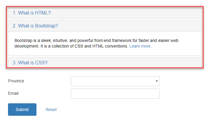
This example converts a standard Free Text Heading Element with instructional text into an accordion-style element.
- Add a Free Text Heading Element on the form.
- Click the Text property in the property panel to open the Editor
- Click the Source Button to switch to source code mode and then paste the following code into the editor.
<div class="panel-group" id="accordion">
    <div class="panel panel-default">
        <div class="panel-heading">
            <h4 class="panel-title"><a data-parent="#accordion" data-toggle="collapse" href="#collapseOne">1. What is HTML?</a></h4>
        </div>
        <div class="panel-collapse collapse" id="collapseOne">
            <div class="panel-body">
                <p>HTML stands for HyperText Markup Language. HTML is the standard markup language for describing the structure of web pages. <a href="https://www.tutorialrepublic.com/html-tutorial/" target="_blank">Learn more.</a></p>
            </div>
        </div>
    </div>
    <div class="panel panel-default">
        <div class="panel-heading">
            <h4 class="panel-title"><a data-parent="#accordion" data-toggle="collapse" href="#collapseTwo">2. What is Bootstrap?</a></h4>
        </div>
        <div class="panel-collapse collapse in" id="collapseTwo">
            <div class="panel-body">
                <p>Bootstrap is a sleek, intuitive, and powerful front-end framework for faster and easier web development. It is a collection of CSS and HTML conventions. <a href="https://www.tutorialrepublic.com/twitter-bootstrap-tutorial/" target="_blank">Learn more.</a></p>
            </div>
        </div>
    </div>
    <div class="panel panel-default">
        <div class="panel-heading">
            <h4 class="panel-title"><a data-parent="#accordion" data-toggle="collapse" href="#collapseThree">3. What is CSS?</a></h4>
        </div>
        <div class="panel-collapse collapse" id="collapseThree">
            <div class="panel-body">
                <p>CSS stands for Cascading Style Sheet. CSS allows you to specify various style properties for a given HTML element such as colors, backgrounds, fonts etc. <a href="https://www.tutorialrepublic.com/css-tutorial/" target="_blank">Learn more.</a></p>
            </div>
        </div>
    </div>
</div>
- Click Save and then generate a preview your form. You'll see an accordion like the one in the screen shot below.

Using BootStrap Components
Now that the full BootStrap library is included on your form, you can use any of the BootStrap components found here withn Free Text heading Elements on your form. We also recommend the articles and how-to guides here, as an easier BootStrap reference

0 Comments