Boxed Colored Header
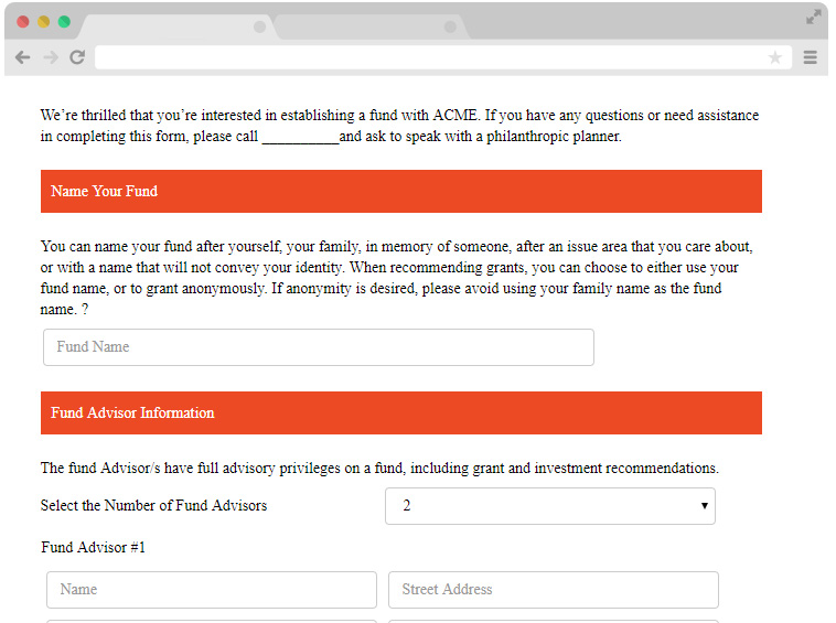
The Boxed Header element used to show a Heading (title) inside of a colored box. Below is an example:

The fields properties are explained below
| Property | Description |
|---|---|
| Field Name | This is the name used to reference the field and is also the name of the column heading in the submission bin. |
| Type | Choose from many heading types, including Basic (covered here in this topic), Custom Graphic, Free Text, Line/Separator, Dynamic, and SSL Seal. Each of these is also available by right-clicking the root form node and choosing Insert New Form Element > Heading/Graphic Text. |
| Dependency | Create a dependency to hide or show this element based on a rule. The field becomes "dependent" on other values entered on the form. Learn more in Dependencies. |
| Hidden | Set this property to true if you want this element to be hidden. |
| Hide Mode | This property determines how the element is hidden and if it will collapse within the space it would otherwise occupy. |
| Heading | Click the button to edit the heading text. |
| Heading-font-family | Click the button to choose the heading font. |
| Heading-Background-color | Click the button choose a color for the heading background. The field provides preset colors, but you can also enter an hex color value |
| Heading Font-color | Click the button choose a heading font color. The field provides preset colors, but you can also enter an hex color value |
| Heading Font-size | Click the button choose a heading font size. |
| Heading Font-weight | Click the button choose a color for the heading background. |
| Align | Choose to align the heading to the left, right or center |
Note
Some of the properties listed under general settings are actually just short cuts to the style properties listed below. They can be configured in either property panel.Tip
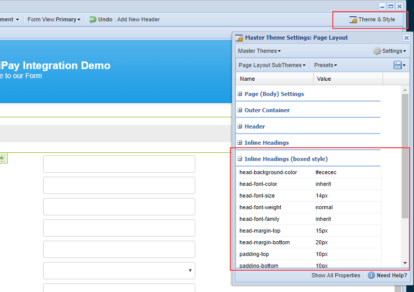
Boxed Headers can be configured as part of the Master Theme > Page Settings so that the colors and fonts apply to all Boxed Headers. Or they can set at the field level.

The following style settings are applied via the current page subtheme, but can be over written per field in the Style Panel. It is recommended that you use the Theme & Style Editor to edit these properties so that they apply to all headings on your form:
| Heading Font-family | Click the button to choose the heading font. |
| Heading Font-color | Click the button choose a heading font color. |
| Heading Font-size | Click the button choose a heading font size. |
| Heading Font-weight | Click the button choose a heading font weight. |
| Heading Background-color | Click the button choose a color for the heading background. |
| Heading Padding-bottom | Enter a value for the heading bottom padding. |
| Heading Padding-top | Enter a value for the heading top padding. |
| Heading Padding-left | Enter a value for the heading left padding. |
| Heading Padding-right | Enter a value for the heading right padding. |
| SubHeading Font-family | Click the button to choose the subheading font. |
| SubHeading Font-color | Click the button choose a subheading font color. |
| SubHeading Font-size | Click the button choose a subheading font size. |
| SubHeading Font-weight | Click the button choose a subheading font weight. |
| SubHeading Background-color | Click the button choose a color for the subheading background. |
| SubHeading Padding-bottom | Enter a value for the subheading bottom padding. |
| SubHeading Padding-top | Enter a value for the subheading top padding. |
| SubHeading Padding-left | Enter a value for the subheading left padding. |
| SubHeading Padding-right | Enter a value for the subheading right padding. |
Have more questions? Submit a request
Please sign in to leave a comment.

0 Comments