Row Action: Edit Page / Alternate Page / Form
This action is part of a Row Action Widget
This Row Action serves multiple purposes and can be used to link to any other page, including drill down pages, edit pages, and forms. The links can be opened in the full browser window or in a Light Box or pop-up window.
General Settings

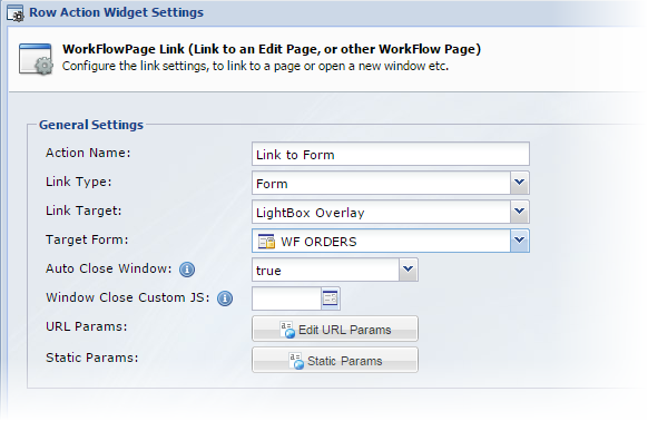
It is important to note, that the settings on the first screen of the wizard change based on the selections made. For example, if you select to open a Light Box, the Auto Close and Window Close Custom JS options will be shown. This is described in more detail below
| Property | Description | ||||||||
|---|---|---|---|---|---|---|---|---|---|
| Action Name | The action name | ||||||||
|
Link Type |
|
||||||||
|
Link Target |
|
||||||||
|
WorkFlow Page |
If you selected 'WorkFlow page' in the Link Type drop down, you can now select the WorkFlow Page to Link to. | ||||||||
|
Form |
If you selected 'Form' in the Link Type drop down, you can now select the form to open | ||||||||
|
Form View |
When linking to a form, you can also choose which formView to use. | ||||||||
|
Window Close Custom JS |
If you selected "LightBox Overlay" in the link type, you can define a custom JavaScript function that will run when the Light Box is closed. | ||||||||
|
Auto Close Window |
If you selected "Light Box Overlay" in the link type, and are linking to a Form or an Edit Page, set this option to true to automatically close the window when the form is submitted. |
Linking to a Form
When linking to a form, a couple of additional buttons will be available.

URL Params
The URL Params button will open a window where you can map values from the current record/row to fields on your form. This will pre-populate the form with the records details.
Static Params
The Static Params button allows you to pass static values into the form to pre-populate fields on the form.
Linking to an Alternate Data Page
When you link to an alternate data page, you can pass through any of the values of the current record to that page to automatically drill down into that data set. For example, if you were displaying a list of customers, you could link to the Order's Data Page and pass the customerID value in to filter the Order's by the current customers.
URL Params
The URL Params button will open a window where you can map values from the current record/row to drill down into the data page you are linking to.
Static Params
Define additional criteria to use when drilling down / filtering the destination Data Page.
Refresh Settings

| Property | Description | ||||||
|---|---|---|---|---|---|---|---|
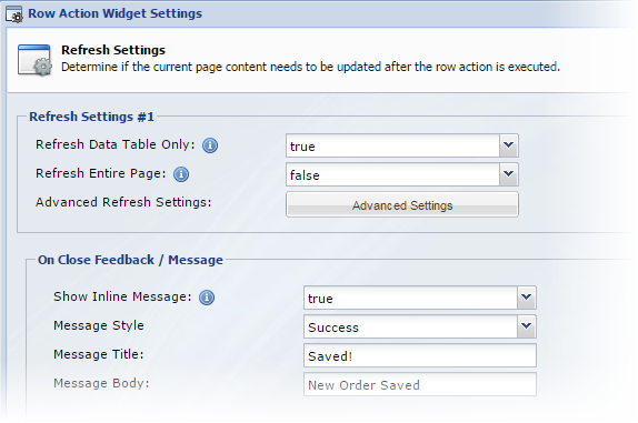
| Refresh Data Table Only New!Bootstrap | Set this to true to reload the dataset without refreshing the entire page. This is usually the best option unless you have a specific reason to reload the entire page (which will be slower) | ||||||
| Refresh Entire Page | Set this to true to reload the entire page. | ||||||
| Advanced Refresh Settings | Click the Advanced Settings button to load the Advanced Refresh Settings window. These settings allow you to target where the refresh will be done and also to target individual DOM elements by ID to refresh. This can be useful if you are using trigger actions with bindings to recalculate total dollar values and need to update specific DOM elements with the results. These settings can also be useful if you are executing actions within a drill down p age and need to target the parent page after an update is performed.
The fields above are provided in duplicate to enable you to trigger re-draws across multiple pages. |
On Close Feedback / Message New!Bootstrap
Configure a message to display to the user after the operation has completed
| Property | Description |
|---|---|
|
Show Inline Message |
Set this to true to display a message |
| Message Style | The Bootstrap style to apply to the feedback element. |
| Message Title | The Title for the feedback |
| Message Body | The Feedback message. |
LightBox Settings
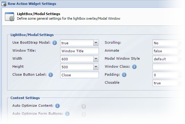
If you elected to open the link in a new window or Light Box, the next screen of the wizard will contain the Light Box settings.

| Property | Description |
|---|---|
|
Use Boot Strap New!Bootstrap |
If you are using the BootStrap theme, you can select to use the BootStrap Style Modal Window. This window style works really well when opening forms that are also styled with a Boot Strap Theme. With this option selected, the Content Settings section will also be displayed with additional formatting options. |
| Window Title | When using a Bootstrap Modal, this is the title of the window |
| Width | The width of the window |
| Height | The height of the window |
| Close Button Label | The Label for the close button when using Bootstrap |
| Scrolling | Determines if scroll bars are shown in the new window |
| Animate | Does the window animate when it is shown |
| Modal Window Style New!Bootstrap | Choose the Bootstrap style for the new modal Window |
| Auto Optimize Content New!Bootstrap | When using the Bootstrap style window, the content (form or workflow page) loaded into the modal window is optimized. For forms, this means the heading element (applies to Bootstrap themed forms only) is hidden and the margins are adjusted. When linking to a workflow page, the headers and menus and padding are all adjusted so the page fits cleanly within the new window. |
| Auto Optimize Form Buttons New!Bootstrap |
When linking directly to a form, and using the Bootstrap style window, this setting will remove the form's submit button and/or next and back buttons (on a multipage form) and nest them in the windows footer. |
Button Settings

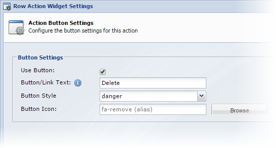
Configure the button style and icon settings.
| Property | Description |
|---|---|
|
Use Button |
Check this box to use a button or leave it unchecked to use a text link |
| Button/Link Text | The text for the button or link |
| Button Color / Style | Select the Bootstrap style for the button. The exact color of the button will change based on the theme applied. For older themes, select the button color. |
|
Button Icon |
Click the browse button to browse the icon library and include an icon with your button |
See Also

0 Comments