Responsive Form Settings
The Responsive Settings property manages how your form displays on a mobile device. By default, all forms created with Logiforms are responsive on all devices - including desktops -- and adjust their layout automatically based on the available size of the browser's viewport.
Responsive Form Settings can be accessed from within the form designer via the top Toolbar > Responsive Form Settings

On This Page
- All Properties
- Overriding Responsive Settings at the Field Level
- Group Settings / Allow Multiple Fields on a Single Line
- Changing Button Colors on Single Button Elements
All Properties
These settings provide more control over how the form appears when viewed in a smaller viewport and when accessed on a mobile phone or tablet.
| Property | Description |
|---|---|
| Responsive Settings Enabled | Default is True. This setting controls if the form is responsive. For some forms, like large financial applications with lots of rows, and heavy use of tables, you may want to disable responsiveness to force the user to re-size the browser and access the form within a larger viewport. If you want the form to only be responsive on a mobile device or tablet, leave this box checked and adjust the setting under Apply To where you can select the devices to target. |
| Increase Field Size | Fields are increased in size when the 'Apply To' rule is matched (Phone, Tablet, and/or Desktop). On a desktop, once the viewport width drops to below 480ox or below, these settings will be applied (assuming desktops are being targeted with the Apply To setting. |
| Increase Caption Size | Captions, headings, and other test elements are increased in size when the 'Apply To' rule is matched (Phone, Tablet, and/or Desktop). On a desktop, once the viewport width drops to below 480px or below, these settings will be applied (assuming desktops are being targeted with the 'Apply To' setting. |
| Apply To | Dropdown list of Phone Phone & Tablet Size Devices, and All Devices (including desktops). This setting determines when the responsive settings will be applied. You can select to target only phones, for example, and none of these settings will be applied on tablets and desktops. Note, that the default responsiveness will still be applied to forms on desktops and tablets. The default behavior can only be disabled by un-checking the Responsive Settings Enabled check box. Hint: While testing your form, you may want to enable 'All Devices', so that you can re-size the browser window and see how the form responds) |
| Excluded Fields | Optional, choose the fields to exclude/hide when the 'Apply To' rule matches |
For any forms using a Button SubTheme other than the Bootstrap theme, the following additional options are available and used to replace the smaller form buttons:
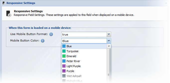
| Use Mobile Buttons Set | Form buttons are replaced with mobile optimized buttons that are larger and easier to touch with a finger. Single Button Elements on your form are also automatically optimized. This setting and the color of Single Button Elements can be overridden at the field level. |
| Mobile Button Color | Select the color for the submit button and for any Sigle Button Elements on the form that do not have a color selected at the field level. |
Overriding Responsive Settings at the Field Level
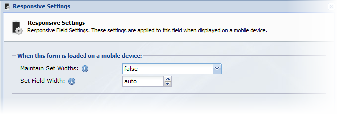
When a form is adapted to a smaller viewport, field widths are changed from their set widths (the default width or a width you have explicitly set), to a 100% width so that the fields can expand and contract based on the size of the viewport. This means if you have a text field, with a width set at 100px, it will automatically be re-sized to 100% width. This setting can be changed per field.

- Click on the field in the Form Outline Panel
- In the General Settings Panel, click the Responsive Settings property to open the settings window.
- In this window, you can choose to maintain the set widths (and skip automatic re-sizing) or you can specify a new width to be used when the form becomes responsive (based on your Apply To settings explained above)
Group Settings / Allow Multiple Fields on a Single Line
Groups with the alignment set to Horizontal allow you to display multiple fields on the same row. When your form adapts to a smaller viewport, these fields will, by default, be shown, each on a separate line and width, at 100% width. To disable this behavior and maintain the field widths and horizontal alignment:
- Click on the group name in the Form Outline Panel
- In the General Settings Panel, set the Not Responsive property to true
Changing Button Colors on Single Button Elements
By default, all Single Button Elements on your form will inherit the color settings defined in the Responsive Form Settings at the form/global level. You can use a different color for each button or elect to not use the mobile button theme on any given button element by editing the button's Responsive Settings.

- Click on the Button in the Form Outline Panel
- In the General Settings Panel, click the Responsive Settings property to open the settings window
- In this window, you can choose to use the mobile button formatting and/or select what color to use

0 Comments