Default Settings for Mobile and Other Devices
The Responsive Settings property manages how your form displays on a mobile device. By default, all forms created with Logiforms are responsive on all devices - including desktops -- and will adjust their layout automatically based on the available size of the browser's viewport.
Forms will also be automatically reformatted to display optimally on mobile phones. It is important to always test your forms on mobile devices and adjust the default Responsive Settings to suit your needs and your forms.
On This Page
Where To Manage Responsiveness
- In the Form Designer, in the Form General Setting panel, click the Responsive Settings button. You can also access the settings from Settings > Responsive Form Settings on the toolbar.
- In the Responsive Form Settings window uncheck True. You can also make other adjustments by device.
- Click Save to close the window and save your changes.
Display On Mobile Phones
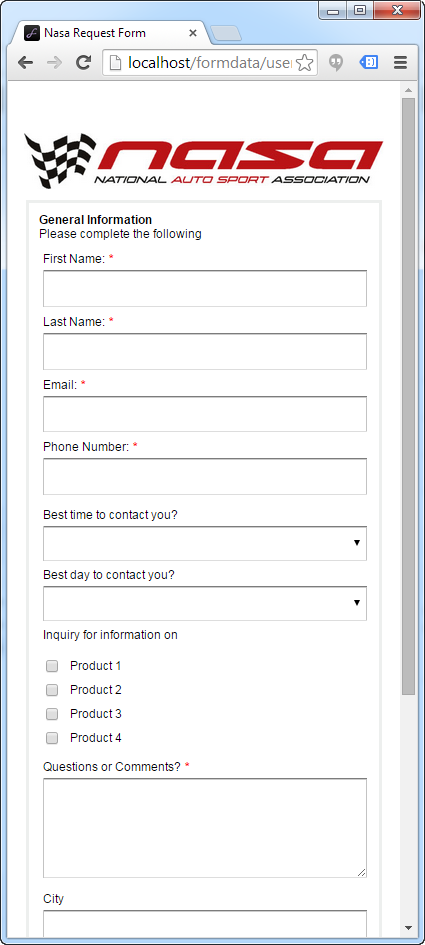
Mobile phones, by default, have the most changes applied via the responsive settings. The following is a list of changes made to your form (by default) to make them display better and provide a more user-friendly experience:
- Multi-column forms are converted to single column
- Fields and field font sizes are increased
- Buttons are replaced with larger, touch-enabled buttons. The default Submit button is blue
- Validation error messages are displayed below the field instead of to the side
- Graphic Headings and Image Fields re-size dynamically
- Radio buttons and checkboxes are adjusted to a single column
Below is an example of how a form may appear (by default) on a mobile device:
| Default Responsive Settings | Full-Size Form |
|---|---|
| Mobile Phone | Desktop Browser |
 |
 |
Most of these settings can be controlled by the Responsive Form Settings, and can also be disabled. For more information about configuring these settings, see Responsive Form Settings.
Display On the Desktop
On the desktop, by default, the form's set width will automatically adapt to the width of the browser. Fields that do not fit on a single line (due to caption size, field size or multiple fields on one line) will drop down to the next line.
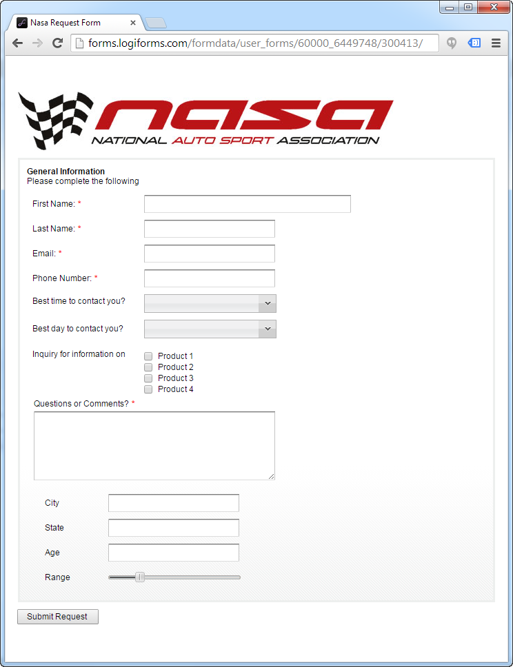
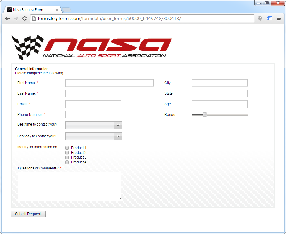
| Default Responsive Settings | Full-Size Form |
|---|---|
| As the browser window is resized below the defined form width, the layout adapts by wrapping fields to the next line. | This is the original, two column form. |
 |
 |
This default behavior applies to all forms, on desktops and tablets. For an example of the default responsive behavior, view this form, and resize your browser window to see the form adjust.
On Tablet Sized Devices
Tablet-Sized Devices (Ipads, Samsung Galaxy Tab, Kindle, etc.), use the same display formatting as on the desktop, as explained above.
Under Responsive Form Settings, you can also elect to apply the same formatting applied to phones, to tablets, and also to desktops.

0 Comments